
In this post we will continue to look at the new "Multiple Map Layers" feature. This feature is available in Tableau 2020.4. In Part 1 we looked at the basic idea. In case you missed it, you can read it here.
by Dilyana Bossenz, Business Intelligence Consultant
The new feature has already been tested by Tableau Community on various methods. Numerous workbooks have been published on Tableau Public where the authors have applied this method to different chart types to show what can be done using this feature.
Here you can find a few examples:
- Layering Marks in Tableau 2020.4 by Jeffrey Shaffer
- Table with Map Layers by Luke Stanke
- Zoomable Dashboard by Adam E. McCann
We will create a chart using the method described by Tableau Zen Master Luke Stanke in his blog article.
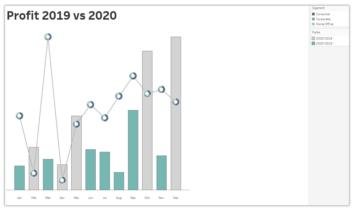
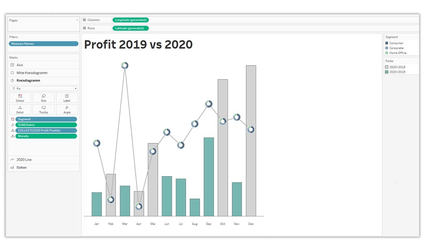
This chart is about comparing "Profit" between 2019 and 2020. 2019 is shown as a bar chart and Profit for 2020 is shown as a line chart. The bars are coloured green if the profit for 2020 is higher than the profit for 2019. Additional pie charts are shown on the line chart. Individual segments are shown in colour on these pie charts.
The idea of the methodology that Luke describes is this: the new feature relates to maps. To create a map, you need latitude and longitude. Latitude is usually between -90 and 90 and longitude is between -180 and 180. To show other chart types, we need to generate longitude and latitude for those. For example, we can replace the longitudes and latitudes with the values between -1 and 1. The procedure is described in detail below.
Create the necessary key figures
2019 Profit
{FIXED MONTH([Order Date]) :
SUM(
IF YEAR([Order Date]) = 2019
THEN Profit
END
)
}
The next step is to adjust 2019 Profit to the scale from -1 to 1. For this we create a new calculated field:
2019 Profit (adjusted)
[2019 Profit]
/
{MAX([2019 Profit])}
2020 Profit
{FIXED MONTH([Order Date]) :
SUM(
IF YEAR([Order Date]) = 2020
THEN Profit
END
)
}
2020 Profit (adjusted)
[2020 Profit]
/
{MAX([2020 Profit])}
We also need the values for our X axis. In our case it is the months. Unfortunately, it is not possible to use the usual dimension with the date format. Therefore, we create a new key figure for the months:
Months
DATEPART('month', [Order Date])
The months are to be displayed on the X Axis. For this we need to create an additional field.
Labels X Axis
MAKEPOINT(
-.05,
MONTH([Order Date])
)
Now we are to convert our key figures into the longitude and latitude. This is made possible by the MAKEPOINT() function.
2019 Profit Points
MAKEPOINT(
[2019 Profit (adjusted)],
[Months]
)
2020 Profit Points
MAKEPOINT(
[2020 Profit (adjusted)],
[Months]
)
In addition, we want to display our bar chart in colour. The colour should have the following logic: If the profit in 2020 is higher than in 2019, then the bar should be coloured green, otherwise the bar remains grey. We create this calculated field for this purpose:
Colour
[2020 Profit (adjusted)]>[2019 Profit (adjusted)]
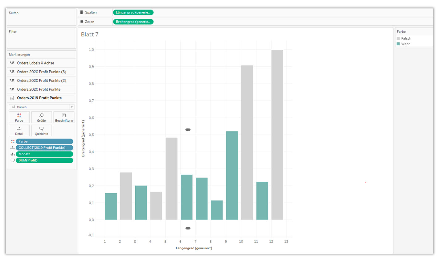
Create Chart
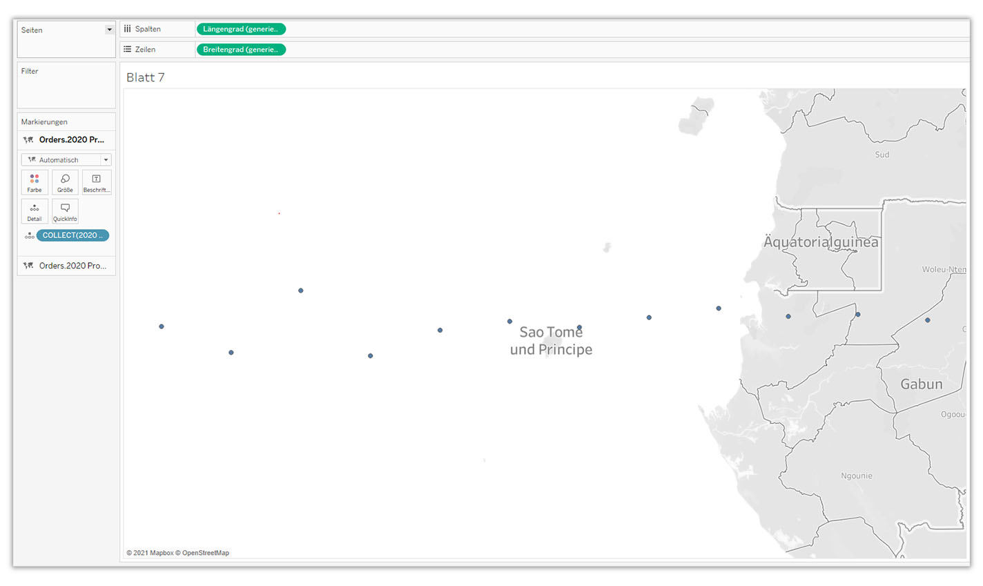
Double click on 2019 Profit Points
Drag 2020 Profit Points onto the map and add a new layer
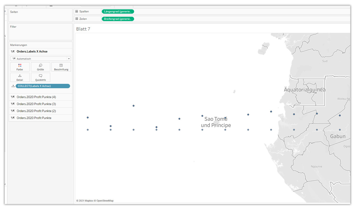
- Create two more layers with the dimension 2020 Profit Points
- Drag Dimension Labels X Axis onto the map and add another layer
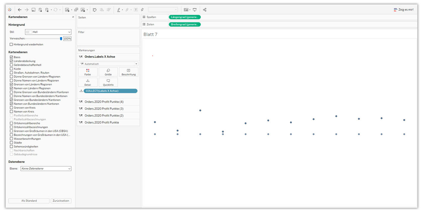
Now we have created all the necessary layers. In this step we switch off the map in the background.
Map -> Background map -> None
- Open the Orders.2020 Profit Points layer
- Change marker from Automatic to Bars
- Add Month to Detail; right mouse button on Months -> change Key Figure to Dimension
- Add dimension colour to the marker colour and then adjust the colour
- Adjust bar size (I have manually selected the size 0.8. Alignment Centred)
- Add Profit to the Quickinfo and adjust Quickinfo
- Rename the layer to Bars
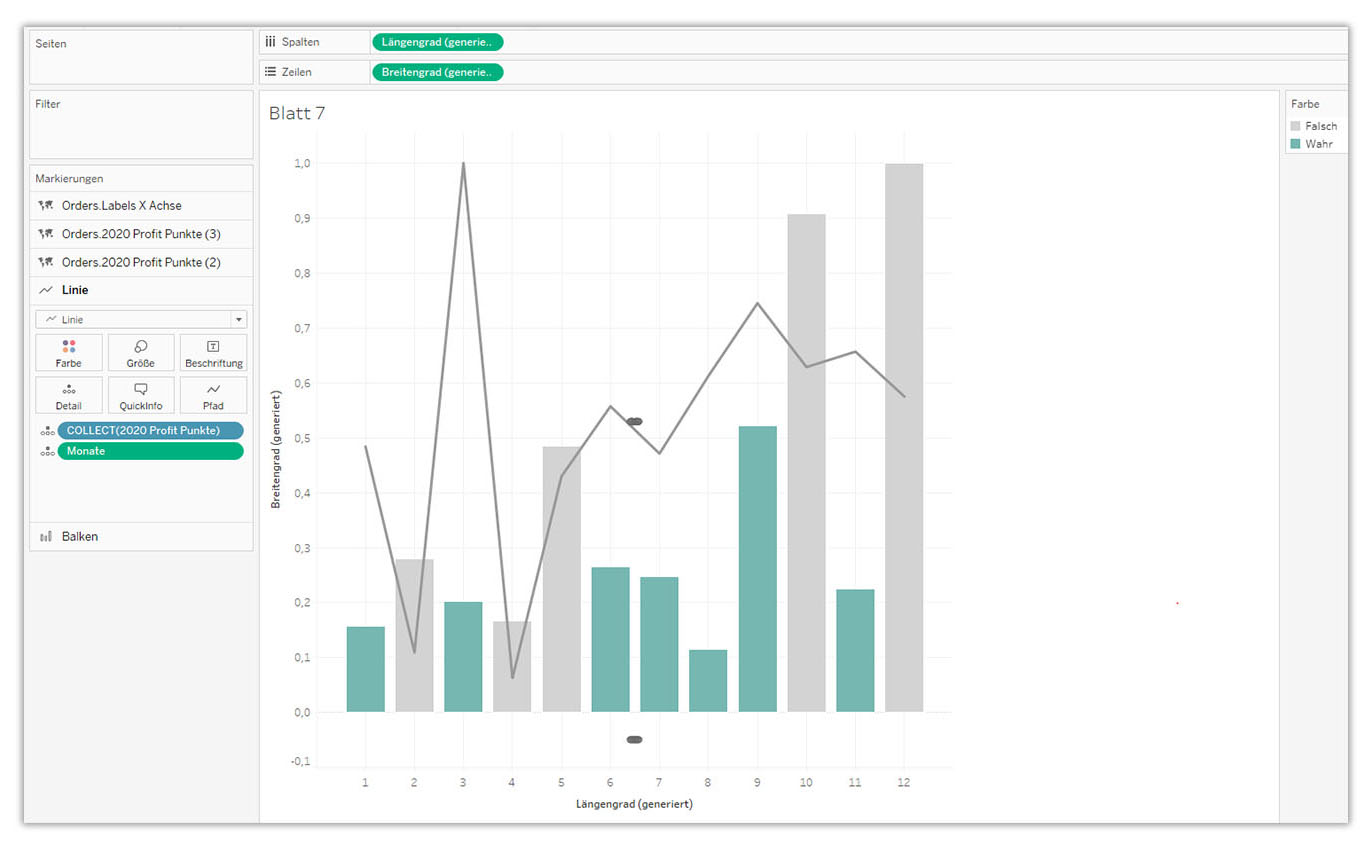
- Open the Orders.2020 Profit Points (2) layer
- Change selection from Automatic to Lines
- Add month to detail; right mouse button on months -> change key figure to dimension
- Rename the layer to Line
- Open the Orders.2020 Profit Points (3) layer
- Change selection from Automatic to Pie Chart
- Add month to detail; right mouse button on months -> change key figure to dimension
- Add Segment to the colour at the markers
- Add Sales to the angle
- Rename the layer to pie chart
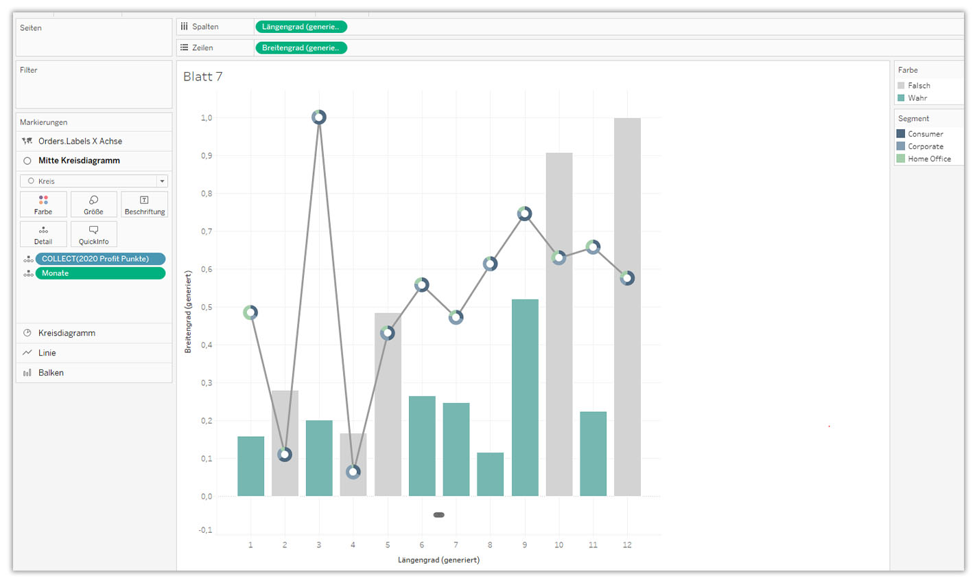
- Open the Orders.2020 Profit Points (4) layer
- Change selection from Automatic to Circle
- Add month to detail; right mouse button on months -> change key figure to dimension
- Change colour to white and adjust pie chart size
- - Rename the layer to pie chart
- Open the Orders.Labels X-Axis layer
- Change selection from Automatic to Text
- Add Month to Detail; right mouse button on Months -> change key figure to dimension
- Drag Order Date while holding the right mouse button. Select option Month Discrete. Format the month label (I chose to abbreviate the months).
- Rename the layer to centre pie chart
Subsequently, format the chart:
- Hide Y and X axis
- Remove grid lines in the background
- Add the heading
- Check Quickinfo and adjust if necessary
Conclusion
This method definitely opens up new possibilities for presenting data visually. To what extent this method is suitable for practice is currently open. This will gradually become clear. With this method, one should be careful when working with the double axis: synchronising an axis with two different scales, for example, is not possible.
For me personally, this method is more complicated than the usual procedure. I need more time to create individual charts. It requires more manual work if several charts are to be displayed at the same time. This feature makes absolute sense when working with maps and thus opens the door to sophisticated design. For the creation of charts, this method is rather less practical.
Do you have questions about the webinar or the use of Tableau? Then you are welcome to contact us at any time.
We look forward to the exchange with you!
Your M2 Team
+49 30 2089870 10
info@m2dot.com · M2@Facebook · M2@Twitter · M2@LinkedIn · M2@Instagram