
Tableau 2020.4 was released in December last year. Again, Tableau is surprising us with new features. As of version 2020.4, Tableau supports multiple marking layers in the maps.

by Dilyana Bossenz, Business Intelligence Consultant
The new feature allows you to create a map with multiple layers. I have taken a closer look at this feature and put together an example for you. Join me in discovering how to use the new Tableau 2020.4 function "Multiple map layers" in practice.
First, I create a map. I will use the data from Superstore, which is always available when Tableau is installed or updated.
- Double click on "State“
- Drag "Sales" to mark colour
With a little formatting I get the following result:
- Edit colour (I selected colour grey)
- Map -> Map Layers -> Washed Out = 100%

Next, I drag Dimension "City" onto the map. A new window opens showing us that a new layout is being added. I place dimension "City" directly on the sign.

I repeat the step with the dimension "Postal Code".

Now you have created a map with 3 different layers (the layers are only visible in the marker shape and not on the map). You can also add more dimensions to add more detail to your visualisation. There is no limit to the number of layers. This function is also available for Spatial data, opening up even more possibilities for geographical analysis.
You can rename the layers:
- Double click on Orders.State
- Rename the layer to State
- Repeat the process for the other layers

I add another layer: Postal Code and rename it "Top". You will see in a moment why this step is necessary.

Now I have four levels, which I will now format.
Level 1: State
The layer can stay like this
Level 2: City
- I drag key figure "Sales" to the Size -> Resize marker (move the slider to the right)
- Colour: Red
- Opacity 25%
- Frame: Red

Level: Postal Code
Change the marker to circle
Drag the indicator "Profit" to colour and adjust the colour. I opted for "Custom diverging". In doing so, I defined only 2 levels: #ff007f for negative and #55ff00 for positive.
Level: Top
Change the marker Automatic to Density
For Density change the colour. I chose Dark Blue. Opacity = 50%; Intensity = 50%
Now drag the layer: Postal Code over the layer "Top". This is how my result looks now:

It is not the best visualization example. I just wanted to show you what is possible with this new feature.
We are left with one last step: Formatting tooltips.
You can determine which info should be displayed from which level. For example, you want the info to be displayed only when hovering over the small circles. The info should not appear on the State level. To do this, move the mouse over the name State and select the option "Deactivate selection".
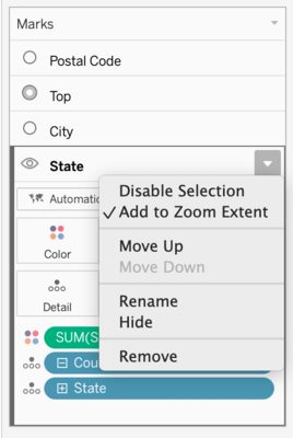
This option gives you the possibility to control the tooltip on your chart.
If you click on the eye symbol, you hide the layer. To show the layer again, click on the eye again.
More examples of how to use the Multiple Map Layers feature will follow in the next blogpost.
Do you have questions about the webinar or the use of Tableau? Then you are welcome to contact us at any time.
We look forward to the exchange with you!
Your M2 Team
+49 30 2089870 10
info@m2dot.com · M2@Facebook · M2@Twitter · M2@LinkedIn · M2@Instagram