

by Dilyana Bossenz
In this blog article, I have summarized 5 mistakes that occur often in practice. I came across these mistakes through my professional experience. Also, I summarized some solutions, which show you how you can avoid these mistakes.
Mistake 1: Double Axis
Problem:
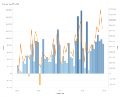
The problem occurs when dimensions differ greatly, like on the screenshot: Sales vs. Profit. It is not clear enough whether profit is represented as a line or as a bar chart. Thus, it is difficult to read the chart. Your audience needs time to understand the chart, read the legend and interpret the numbers.
Solution:
Cole Nussbaumer Knaflic advices three solutions for the secondary y-axis:
“Pull the graphs apart vertically so you can still leverage the same x-axis across both, but each gets its own left-hand y-axis so you can title and label them directly.“
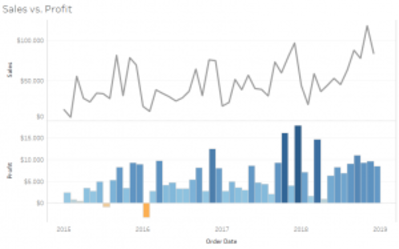
„Don’t show the second (right-hand) y-axis but rather labeling the data in the secondary series directly.”
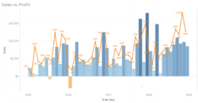
The third solution is coloring the axis and data in the chart. For example, you could write the left axis profit blue and keep the profit bar chart blue. On the left axis, you could color orange and show the orange line for the sale. And again, don’t show the second axis.
Mistake 2: Trancatinationing of the axis
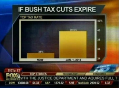
In this picture, you see the change in the top tax rate if the Bush tax cuts expire, so they showed the rate now and what it was in January 2013. There is a big gap between the bars, isn’t it? And why does it look huge? Let’s have a closer look: The value axis starts at 34 percent instead of zero. This is the mistake. Never do this with bar charts, as the length is a visual cue.
Problem:
The cut off axis creates a visual illusion and does not correspond to the truth.
Solution:
Don’t lie with data. Show the truth! Show the y-axis from 0. Now you see, the gap is not as huge as on the original picture. Thus your interpretation will be different.

Mistake 3: Pie chart/Donut chart (in 3D)
One of the famous misleading examples of the pie chart was represented by Steve Jobs.
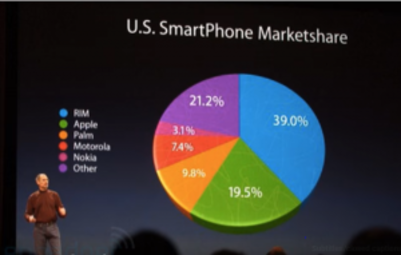
Problem:
19.5% represented by the green part of the pie. Visually, if you don’t have those cues of annotations it looks to the eye larger than 21,2%. The orange and yellow parts look like they have the same size. This pie chart is confusing because the visual ratios don’t correspond to the annotations. Presentation in 3D doesn’t let the eye effectively take in the data and let focus graphs in a way that may be misleading. Presentation in 3D is simply a decoration of data and nothing more!
Solution
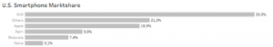
The bar chart is a good alternative for the pie chart, as the length of the bars let the eye better see the differences. The descending order of bars helps to understand better data ranking.
If you’d like to use a 3D Pie Chart in the future, please remember Andy Kriebel’s statement „Friends Don’t Let Friends Use Pie Charts“.
Mistake 4: Geometric calculation
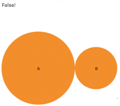
Assume, we use area of shapes (e.i. circles) for our visualisation, to represent different quantitative values. One common mistake when using circles is simply to modify the diameters. For example, if a quantitative value increase from 10 to 20, just double the diameter – That’s the most common answer I always hear. But it is wrong.
Problem:
Usually, the viewers, when perceiving the size of a circle, perceive its area, not the width of the circle (see the picture below). That’s why we must bring the area into focus, not the width of circle! The orange circles show the wrong way by increasing the quantitative value from 10 to 20. In this case, the diameter of circle is increased: the value of A is twice the size of B.
Solution:
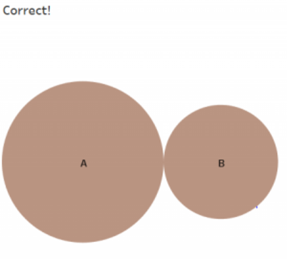
In geometrical terms, we should focus on this formula A = πr² and not on this one: D = 2r
The brown circles show you the correct way of increasing: B circle has half of area A.
The brown circle area calculation is the correct way to encode these two values, whereas the orange circle calculations disproportionately shrink circle B by halving the diameter rather than halving the area. This makes it appear much smaller than its true value.1
For this point I would like to quote Andy Kirk: “Precision in perception is one thing, but precision in design is another. Being truthful and avoiding deception in how you portray data visually are fundamental obligations”.
Mistake 5: Missing data
If you have gaps in your data set, and the missed data is relevant for your viz, then you should point this information out.
Problem:
If you hide the information about missing data, your audience can interpret your viz wrong.
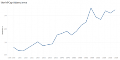
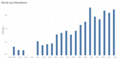
This chart shows you, the number of attendances of the world cap over the years. To be more precise, from 1930 until 2015. This data has also gaps. However, you cannot see them on the line chart „World Cap Attendance“.
Let’s have a look at an alternative visualisation with this data:
Do you see now a gap between 1940 and 1945? With the bar chart, you can point out the missing data better than with the line chart. (Even though, the line chart is the best practice to represent trends.) However, it doesn’t mean, you should always use the bar chart by missing data.
Solution
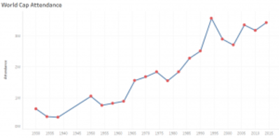
Use scatterplot as a second chart and put both charts together. The dots of scatterplot are powerful, as they point the missing information out. Also, use annotations and help your audience to find the explanation for the gaps in the data. Sometimes it is necessary to manipulate data by data wrangling. It depends on, what data is missing and what effect do these data have on your data visualization.
As the designer or presenter of data visualizations, your design choices should establish trust between the reader and the graphic. Your design choices should facilitate communication. Otherwise, you risk the overall credibility of your message among readers.
1 Andy Kirk: Data Visualisation
Picture sources:
This article was first published on vizpilgrim.com.