- Alteryx
Topic Thursday: Set Classic Mode for Input and Output
Alteryx tips from our expert Alexander Gross
Read more
Eighth part of our new series "Topic Thursday" with valuable tips and insights around the topic Alteryx. The articles are written by our colleague Alexander Gross, Business Intelligence Consultant and Alteryx Lead at M2.
Some of us spend a lot of time in Alteryx Designer, so it's natural to customize the look and feel to our liking. In this article, you'll learn what options are available and how you can use them to improve your user experience!
Personally, I often work on workflows late at night and try out new ideas. In typical computer scientist fashion, there is often no light in the room, so the white Alteryx Canvas is glaringly obvious. Therefore, I personally change the color of the canvas immediately in almost every Alteryx installation to be able to work well even at later hours.
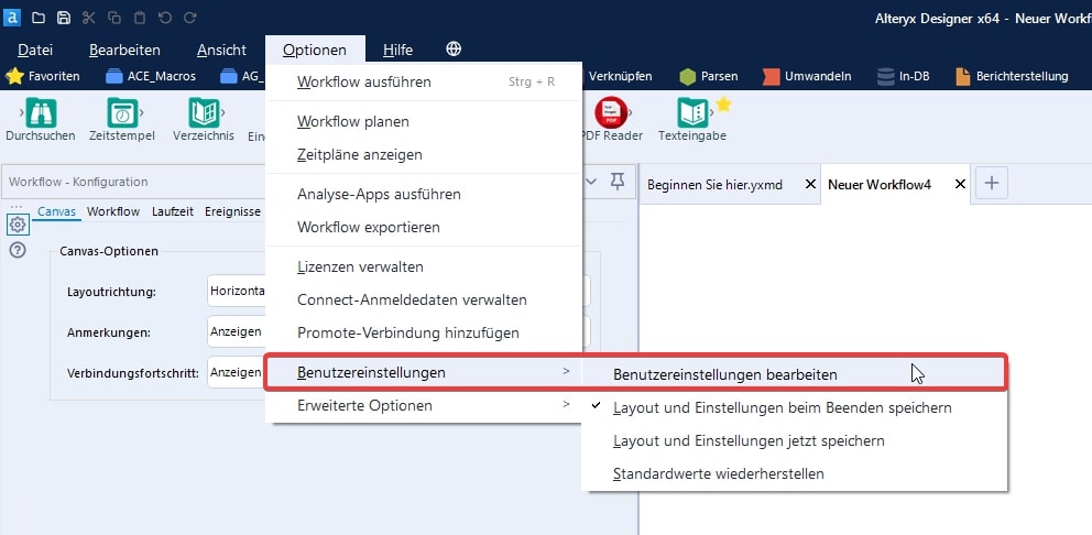
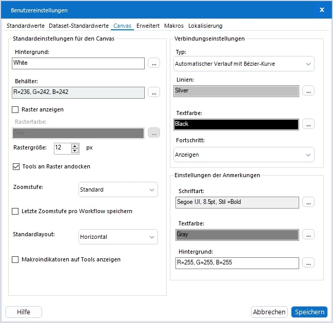
Under Options -> User Preferences -> User Preferences in the tab "Canvas" you can find the corresponding options:


Here you have numerous options, not only for the background, containers or grids, but also the possibility to change the linetype or the font of the annotations.
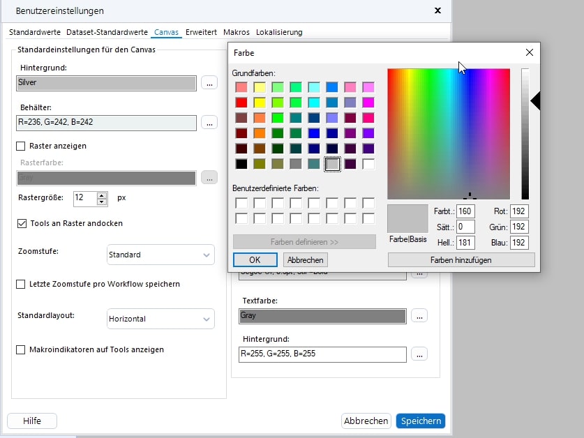
Since it is unfortunately not possible to set up Alteryx Designer in a true dark mode, I recommend coloring the background in a light shade of gray instead. This is sufficient for me to be able to work well with the designer even in a dark room (it is recommended to set the line color to black):


Every second Thursday is Topic Thursday: our colleague Alexander Gross, Business Intelligence Consultant & Alteryx Lead at M2, shares his expert knowledge on workflow building in Alteryx. With his tricks and tips, you can use Alteryx even more efficiently.
Do you have any questions about this article or about Alteryx in general? Then please feel free to contact us at any time. We look forward to exchanging ideas with you.
Your M2 team
Phone: +49 (0)30 20 89 87 010
· info@m2dot.com
· M2@Facebook
· M2@Twitter
· M2@LinkedIn
· M2@Instagram