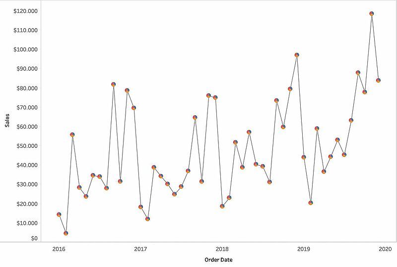
Let’s assume you want to know your overall sales numbers per day, broken down by category within the same chart. You might not succeed at the first go.
But there is a way to display this specific need for information. A fancy line chart with pie charts per each data point on top will give you this level of information.
One easy way to create this view is the Level of Detail (LOD) calculations. In the older versions (version 8 or prior) you will be also able to realize this using the table calculation function Window_Sum.
So, let’s dive into it.
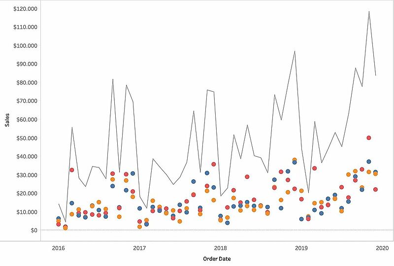
You would think that creating a dual axis view with a line chart and a pie chart using your secondary dimension in the “Angle” pillow solves your problem, but it doesn’t. You end up with this:
This is because Tableau is missing a valuable information: the sum of the measures to be split up by Category (or whatever secondary dimension you are interested in). Only the numbers PER Category are known, as the level of detail is based on the dimensions in the view.
LOD calculations come to the rescue.
With a calculated field „Sales (LOD)“ using the formula {EXCLUDE[Category]:SUM([Sales])} we are able calculate the sum of Sales at the level of detail defined in the view without including Category as part of the level of detail, even if Category is in the view.
So, this is what you need to do in order to get fancy:
1. Create a Line Chart with Sales over time
2. Create a Calculated Field „Sales (LOD)“ using the formula {EXCLUDE [Category]:SUM([Sales])}
3. Place Sales (LOD) as the second measure on the Rows shelf
4. Change the mark type to Pie Chart for the second mark
5. Add Category to the Color pillow and Sales to the Angle pillow
6. Choose Dual Axis for Sales (LOD) on the Rows shelf
7. Synchronize axis
The second option is to simply calculate the Window_Sum of Sales in order to get the necessary measure aggregated one level higher than in the view.
1. Create a Line Chart with Sales over time
2. Create a Calculated Field “Sales (WINDOW_SUM)” using the formula WINDOW_SUM(SUM([Sales]))
3. Place Sales (WINDOW_SUM) as the second measure on the Rows shelf
4. Change the mark type to Pie Chart for the second mark
5. Add Category to the Color pillow and Sales to the Angle pillow
6. Edit the Table Calculation for Sales (WINDOW_SUM) in the Rows shelf to “Compute using: Category”
7. Choose Dual Axis for Sales (WINDOW_SUM) on the Rows shelf
8. Synchronize axis
If you have any questions or comments, please feel free to contact us at any time.
We are looking forward to the exchange with you!
Your M2 Team
+49 30 2089870 10
info@m2dot.com · M2@Facebook · M2@Twitter · M2@LinkedIn · M2@Instagram


